cybermad
Clan Leader
- Modelo
- Z3 2.8 / GR86
- Registrado
- 11 Feb 2008
- Mensajes
- 106.350
- Reacciones
- 93.723
pues me quedado a cuadros al ver esta noticia del NY times, yo pensaba que era una helice de avion de cuando hacian motores de avion en sus origenes, pero dicen que lo confirmaron en el BMW Museum en Munich y BMW North America, son los colores de la bandera de baviera y no tiene nada que ver con aviones, que toda esa leyenda urbana es por un anuncio de 1929 en el que ponian el logo a una avioneta 
anuncio de 1929

evolucion del logo

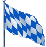
bandera de baviera
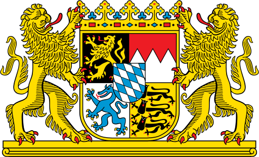
escudo de armas de baviera
BMW Roundel: Not Born From Planes - Wheels Blog - NYTimes.com
BMW Roundel: Not Born From Planes
For decades, the spin on BMW’s signature roundel — the automaker’s logo, which looks like a propeller blade set against a blue sky — was that it represented a propeller blade set against a blue sky. The design was supposedly a tribute to the roots of Bayerische Motoren Werke (or Bavarian Motor Works in English) in the early 20th century, when the company built aircraft engines.
Well, think again.
In last Sunday’s Automobiles section, I wrote about visiting a quartet of German car museums. At the BMW Museum in Munich, my affable tour guide, Anne Schmidt-Possiwal, explained that the blue-and-white company logo did not represent a spinning propeller, but was meant to show the colors of the Free State of Bavaria.
I was surprised. My editor was surprised and skeptical (editors are paid to be skeptical). He reached out to BMW North America for clarification. We received a note from Dave Buchko, a company spokesman, who said “the shape and configuration of the roundel was meant to replicate a spinning propeller against a blue sky background.”
But earlier this week, Mr. Buchko generously allowed in an e-mail message that Ms. Schmidt-Possiwal had been right. Tom Plucinsky, another BMW spokesman, said in a telephone interview that the company once thought the logo was based on a propeller.
“In fact, I have an old history book here that says it is,” he said. “But this all changed in the past year, with the clarification that the roundel was used in an advertisement next to an airplane. We felt that we had to go back and correct this. Brand studies have shown that the roundel over the years has become one of the most recognizable logos, right up there with the Coke bottle.”
According to a history published on the BMW enthusiast site 318ti.org, the trademark was registered in 1917, and it featured the letters BMW “at the top of the outer ring. The inner featured quadrants in the Bavarian Free State colors of blue and white - but in the opposed order - because it was illegal to use national symbols in a commercial trademark.
“The design was not in any way connected with aircraft engines or propellers. The idea that the blue and white had anything to do with spinning propellers comes from a 1929 advertisement, which featured aircraft with the image of the roundel in the rotating propellers.”
So, apparently, that’s that. If you care to make a friendly wager about the topic, feel free to quote Ms. Schmidt-Possiwal and Mr. Plucinsky.
Except, really, doesn’t that roundel look like a propeller blade set against a blue sky?
anuncio de 1929
evolucion del logo
bandera de baviera
escudo de armas de baviera
BMW Roundel: Not Born From Planes - Wheels Blog - NYTimes.com
BMW Roundel: Not Born From Planes
For decades, the spin on BMW’s signature roundel — the automaker’s logo, which looks like a propeller blade set against a blue sky — was that it represented a propeller blade set against a blue sky. The design was supposedly a tribute to the roots of Bayerische Motoren Werke (or Bavarian Motor Works in English) in the early 20th century, when the company built aircraft engines.
Well, think again.
In last Sunday’s Automobiles section, I wrote about visiting a quartet of German car museums. At the BMW Museum in Munich, my affable tour guide, Anne Schmidt-Possiwal, explained that the blue-and-white company logo did not represent a spinning propeller, but was meant to show the colors of the Free State of Bavaria.
I was surprised. My editor was surprised and skeptical (editors are paid to be skeptical). He reached out to BMW North America for clarification. We received a note from Dave Buchko, a company spokesman, who said “the shape and configuration of the roundel was meant to replicate a spinning propeller against a blue sky background.”
But earlier this week, Mr. Buchko generously allowed in an e-mail message that Ms. Schmidt-Possiwal had been right. Tom Plucinsky, another BMW spokesman, said in a telephone interview that the company once thought the logo was based on a propeller.
“In fact, I have an old history book here that says it is,” he said. “But this all changed in the past year, with the clarification that the roundel was used in an advertisement next to an airplane. We felt that we had to go back and correct this. Brand studies have shown that the roundel over the years has become one of the most recognizable logos, right up there with the Coke bottle.”
According to a history published on the BMW enthusiast site 318ti.org, the trademark was registered in 1917, and it featured the letters BMW “at the top of the outer ring. The inner featured quadrants in the Bavarian Free State colors of blue and white - but in the opposed order - because it was illegal to use national symbols in a commercial trademark.
“The design was not in any way connected with aircraft engines or propellers. The idea that the blue and white had anything to do with spinning propellers comes from a 1929 advertisement, which featured aircraft with the image of the roundel in the rotating propellers.”
So, apparently, that’s that. If you care to make a friendly wager about the topic, feel free to quote Ms. Schmidt-Possiwal and Mr. Plucinsky.
Except, really, doesn’t that roundel look like a propeller blade set against a blue sky?


